CRAVER CREEK PRODUCE
A local produce farm was in need of a graphic identity. Using the produce grown, an identity was born to accompany the growing family business.

Simplistic Design
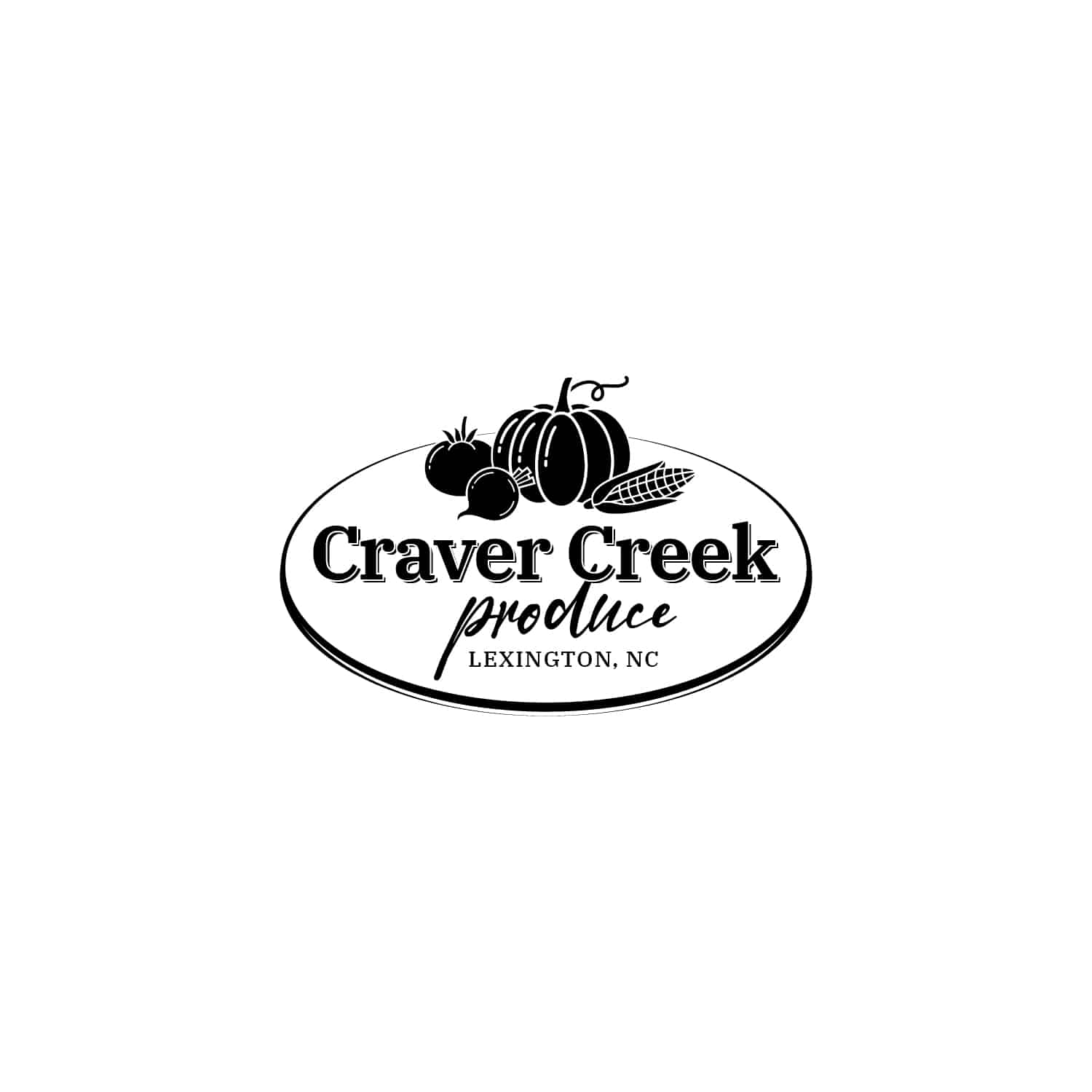
The owner of Craver Creek Produce was in search of a design that would easily convey what they do in a glance, but with a classic feel. Mr. Mike wanted his logo to be simple, so he could put it on a patch for a hat.
Multiple concepts were presented and they can be seen below. The colors are subdued and inviting; creating a warm, first impression.
01
IDENTITY DEVELOPMENT
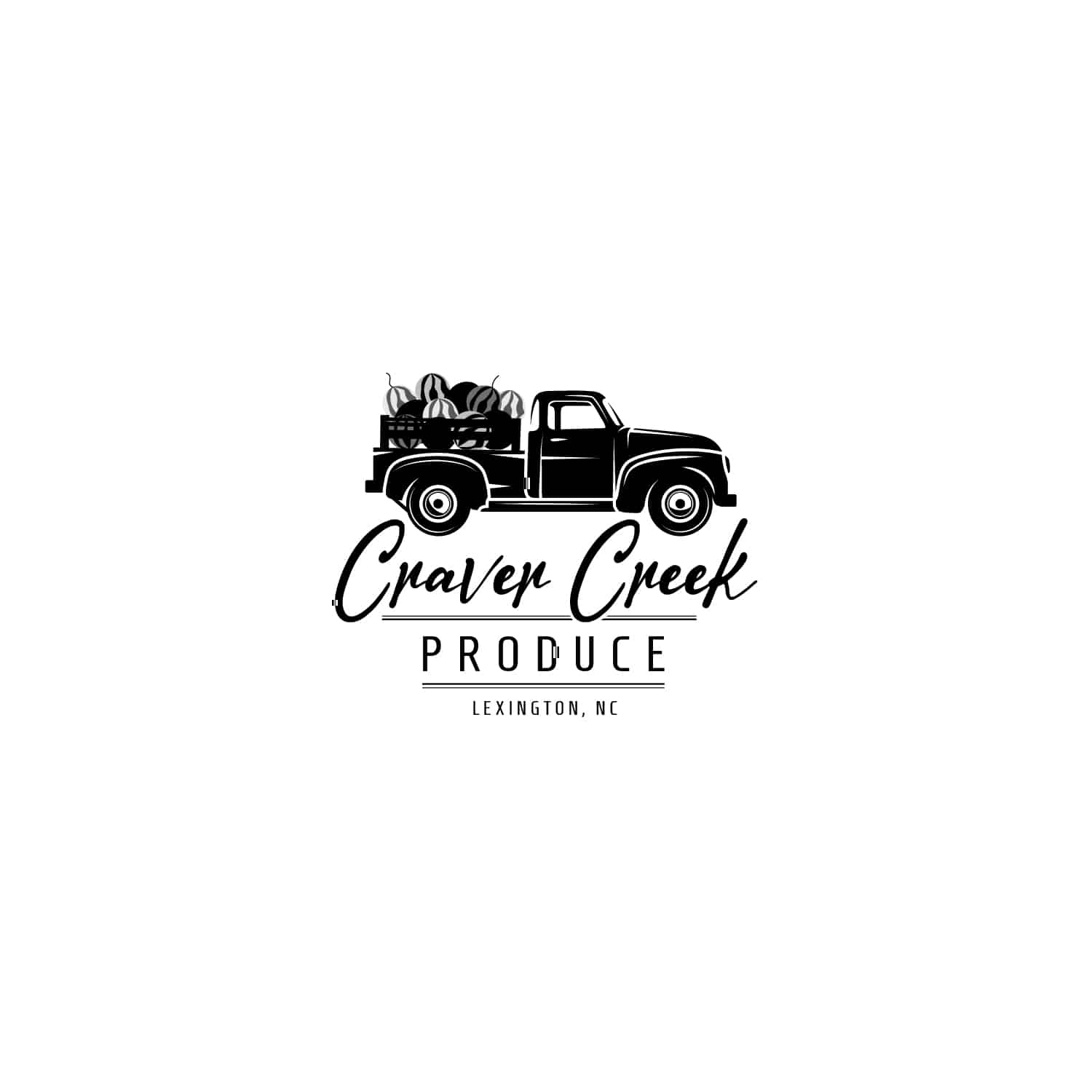
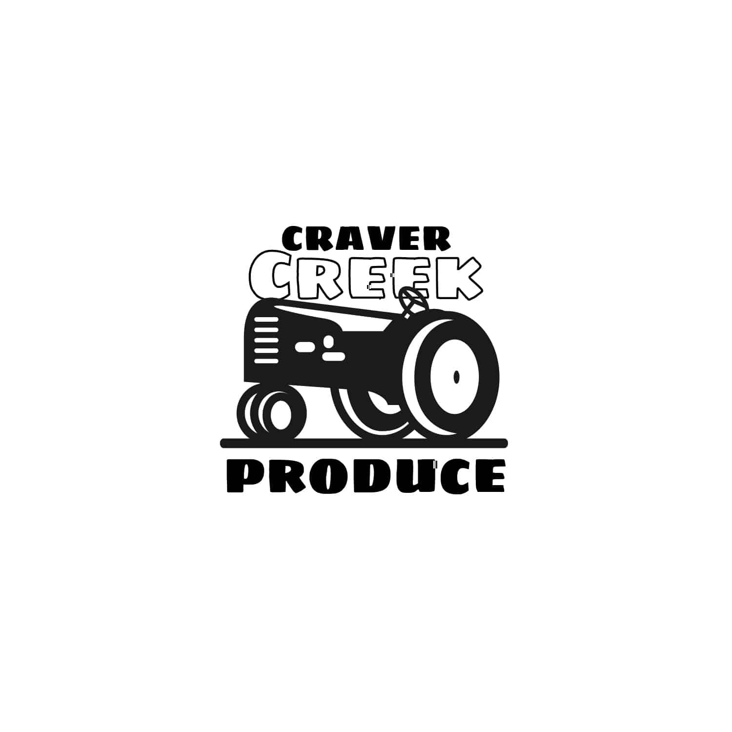
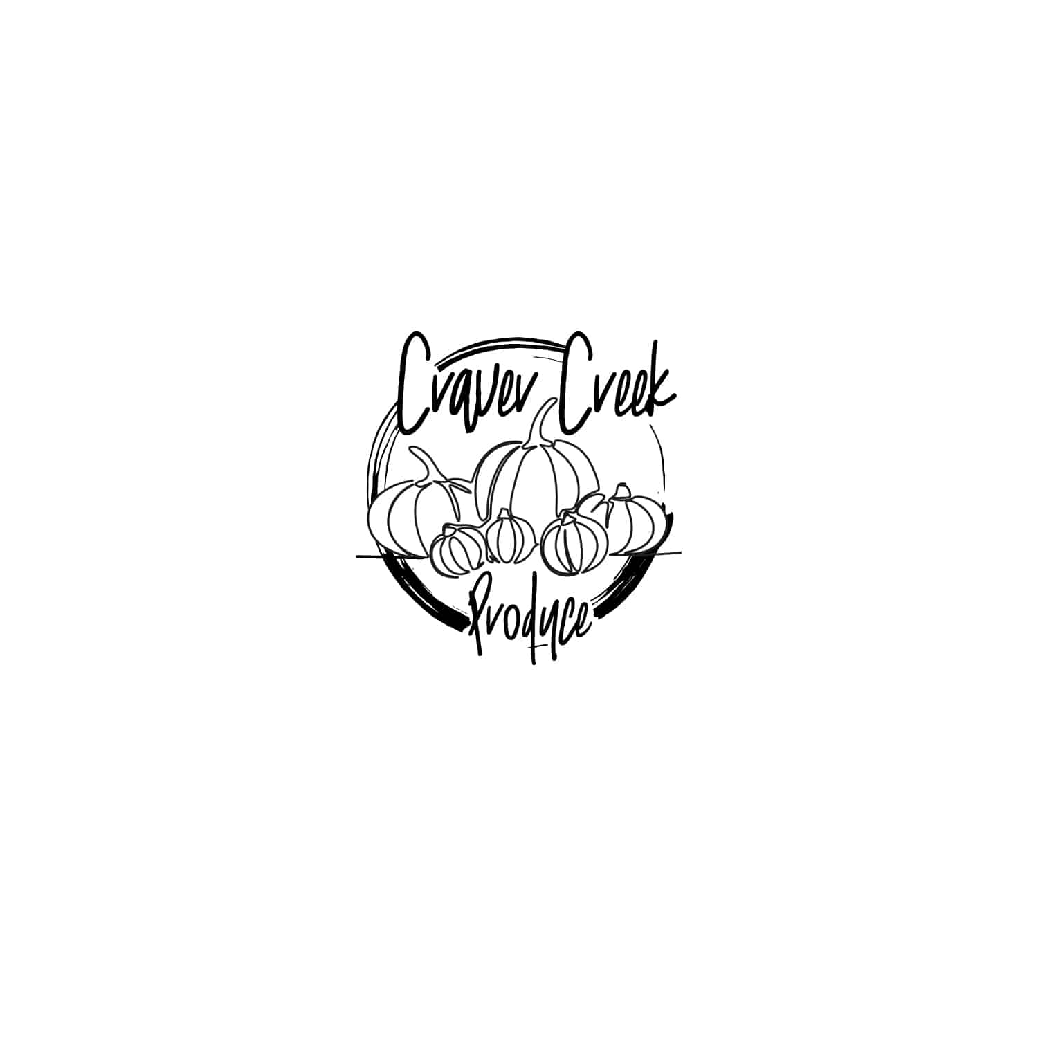
When developing the identity to represent Craver Creek, showing a variety of produce was important! Some concepts presented included a tractor, a truck full of watermelons and an abundance of pumpkins.
Mr. Mike grows and sells produce such as radishes, watermelons, pumpkins, corn and tomatoes. But he mostly sells watermelons and pumpkins. Settling on a seal-like design implied longevity and a dependable resource for produce. Craver Creek prides itself on consistency and quality produce. Visit them on facebook here.
IDENTITY APPLICATION
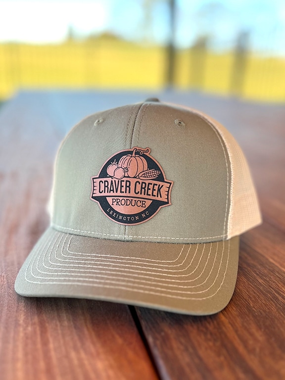
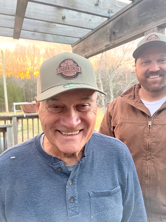
Promotion of Craver Creek Produce in the form of a hat is about the best form of advertising in a small town. Wearing your brand is always a plus!
Mr. Mike was one proud and excited produce farmer.
VIEW MORE
Branding