INDUSTRIAL SEW PARTS +
Developing the identity design for Industrial Sew Parts+ was a successful process for my client, Jonathan. It was definitely exciting to see this one come together.
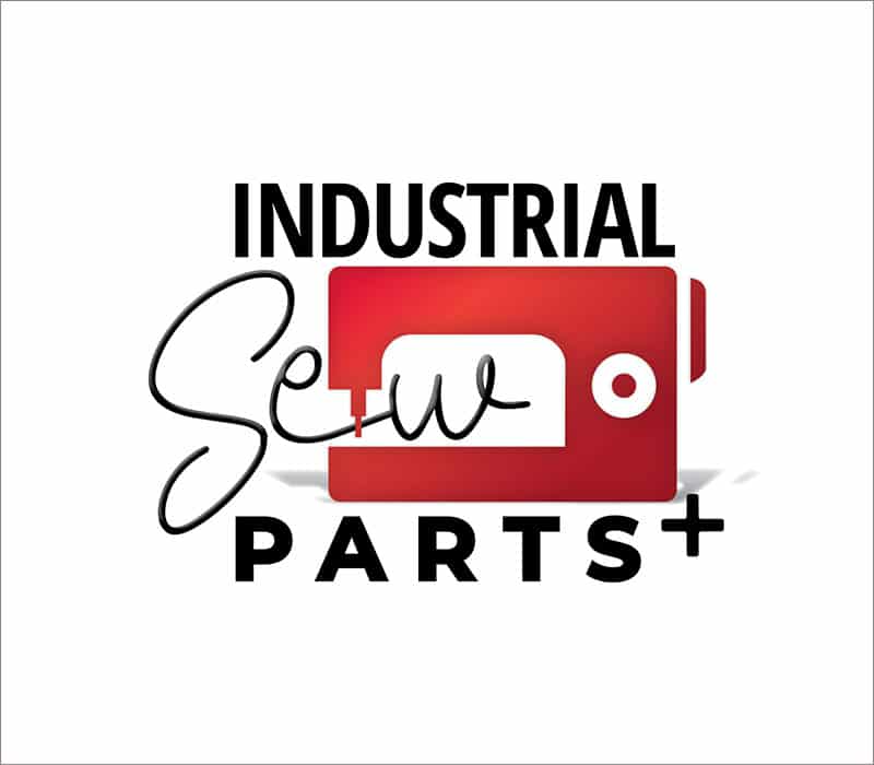
A simple, red graphic was his only request in the design.
Since color is added in the final stage of design, “simple” communication of the sale of industrial sewing parts was the goal. In addition to offering designs with the obvious graphic of a sewing machine, options were also given showing other sewing related items, such as needles and thread, and patterns that would mimic a sewing line. See more looks below.
Black, gray and NC State Red was applied toward the end of the process, along with a graphic showing depth and gradation was included in the final files.
01
IDENTITY DEVELOPMENT
Jonathan was super patient. The time of year we started this design was immediately after everyone’s busy season; Christmas. He told me we had plenty of time to really develop the graphic and he wasn’t in any hurry. Sometimes that’s not the case!
We were able to take the alotted 2 weeks for each round of designs and come up with what worked for his business the best.
02
SMALL TWEAKS
For the final designs, fonts and composition changes were explored. Out of these design, color was applied with options also, leading to the final chosen design!
FINAL FINESSE
Ready for any application, Jonathan’s identity for his new company is complete, beaming with a bright red sewing machine, contrasting black letters, and simple, clean lines to convey sales of Industrial Sew Parts Plus.
VIEW MORE
Branding

