REEDS BAPTIST CHURCH
A local church in need of a new brand, capturing the essence of what they preach…
LOCATION IS INSPIRATION
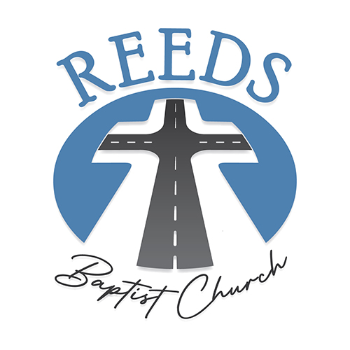
The importance of location was key for this client. Bringing an idea of crossroads — since that’s where they are located — was crucial to their design. They wanted a visual of two roads coming together creating crossroads, as well as the cross Jesus died on to emerge when seen. The combination truly embraces the idea of a decision.. much like the one to follow Christ. I enjoyed designing this logo for Reeds Baptist Church in Lexington, NC.
IDENTITY DEVELOPMENT
Reeds Baptist Church approached me to do a new identity for their established church.
Their criteria was simple. A crossroads and a cross were initially requested for the visual identity, to help continue the spread of the good news they already proclaimed at their church in Lexington, North Carolina. Along with the main idea of the crossroads, other designs were also given with the initial concept; some shown here.
After three rounds, a final design was chosen with the request for a few additional versions, such as the emblem only, words only and one with the emblem completed as a circle with the type.
02
IDENTITY VARIATIONS
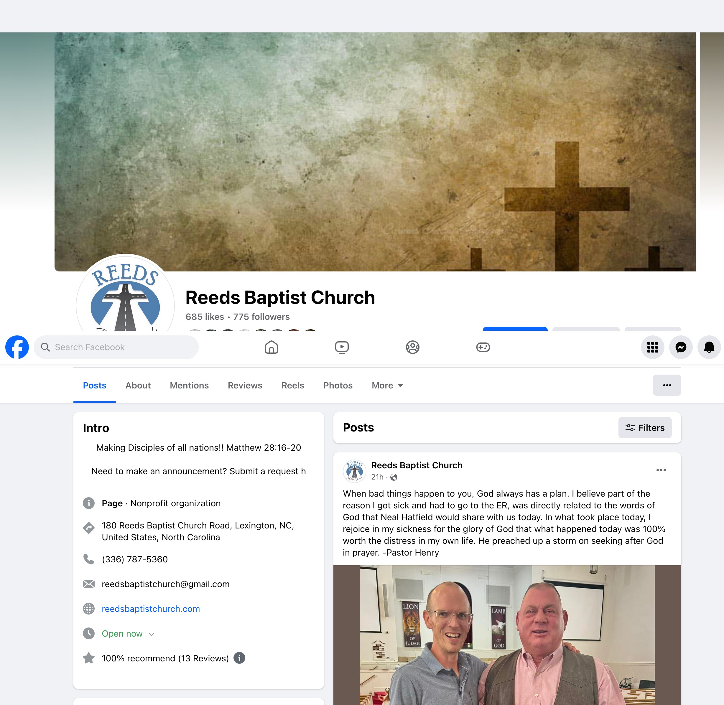
Every size and color needed for Reeds Baptist Church was supplied for use; black and white and color, horizontal and vertical, flat and created depth and emblem and words only, including a special graphic for facebook.
03
IDENTITY APPLICATION
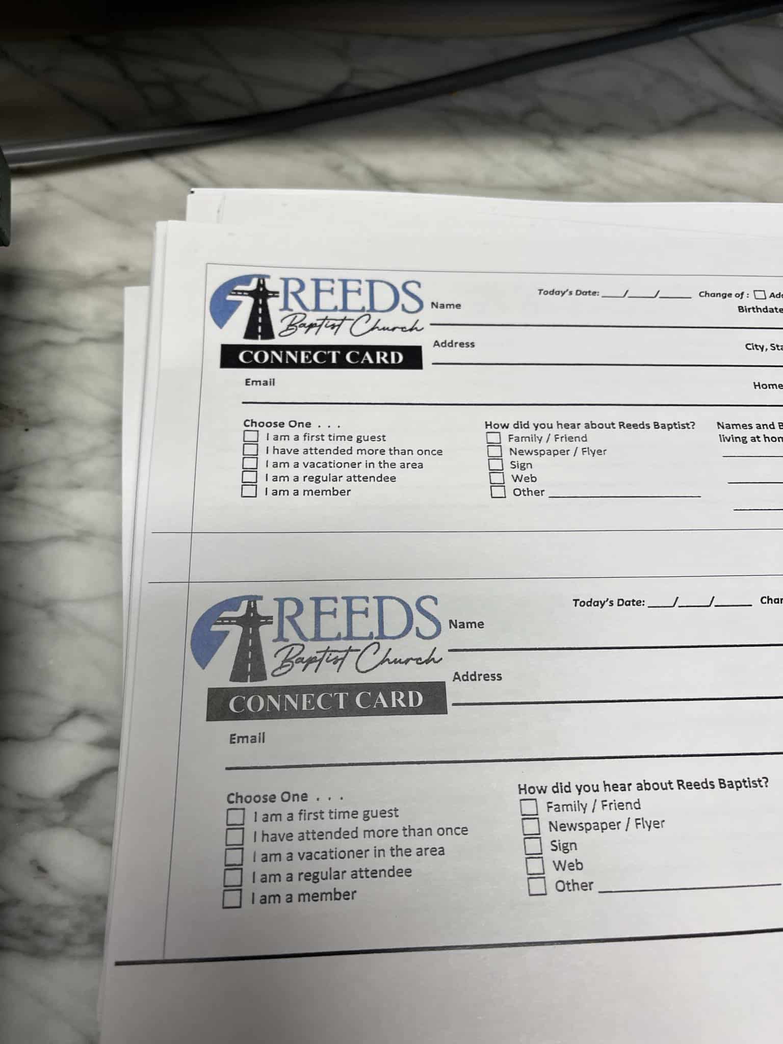
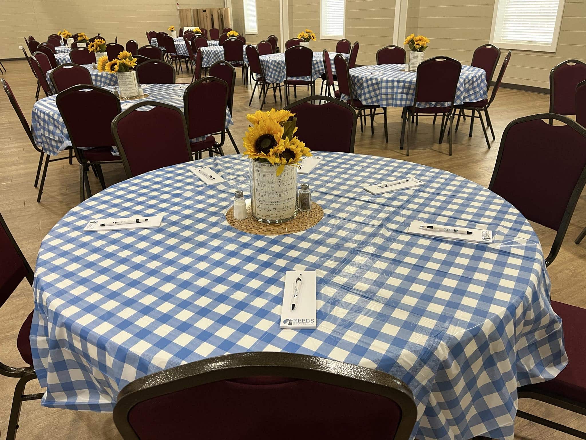
Custom notepads and pens were created for the homecoming event as well as new member cards for use in service.
They are rolling out the new logo slowly, allowing members to adjust to their new look.
VIEW MORE
Branding

